Monday, April 8, 2013

Float

My inspiration was to make it seem like he was levitating when he put his hands to the side.
My technical problem was trying not to let anything distract my background.
My artist problems was trying to make his feet the same size and i fixed that in photo shop.

 My inspiration was to make it seem like he was flying up.
I didn't have any technical problems.
My artist challenge was he had to keep jumping so i just made the shutter speed faster to catch him in the air.

My inspiration was to make the picture seem like he was kicking his hat in the air.
My technical problems was the lighting so i had to move to fix that.
The artist challenge was to make the hat be in front of his foot but that was easy to get.

Thursday, March 21, 2013

Poses

 When i took this i was on top of the little hill by the office.
I had problems with the sun when i took this picture.
This one stood out because he didn't have much sun in his face.
I think the shadows could be improved.

 When i took this we were under the Q-hut.
I didn't have much problems taking this picture.
I like it because i like the lighting and the other pictures don't have such good lighting.
I could improve by getting him more and taking things away from the background.

 I was by the bending machines when i took this picture.
I had problems getting shadow in his face.
I like this picture because the way he posed.
I could improve distractions from the background.

 I was by the front gate when i took this picture.
I had problems with this because the sun was in his face.
I liked it because i was kinda able to fix the sun from getting in his face.
I think i could've improved the sun light by moving.

 We were behind the 200 building when i took this picture.
I didn't really have problems taking this picture.
I like this picture because there's not really any distractions in the picture.
I think i could improve this picture by cropping off some parts with too much light.

 I was next to the Q-hut when i took this picture.
I had problems with the lighting.
I like it because i like the spot where i took this picture and there's not much sun in his face.
I could improve by trying to get the picture from a direction where the sun wont be too bright.

 I was by the lunch tables when i took this picture.
I dint really have much problems taking this picture.
I like the lighting that stood out to me and how its a random picture.
 I think i could improve the lighting in the background.

 I was next to the Q-hut when i took this picture.
I had problems with the lighting his face.
I like it because it's weird & random.
I think the lighting could be improved.

 I was in front of the office when i took this picture.
I dint really have problems taking this picture.
I like how the sun wasn't around and how he posed.
I could improve the background.

I was by the lunch tables when i took this picture.
I had problems with the lighting.
I like it because he looks so innocent and quiet.
I could improve the lighting.

The most challenging thing was with the lighting i had problems with that but i just tried to find spots where the sun wasn't around.
I think my skills improve with better pictures and knowing what directions to take the picture from and How to take distractions away.
I would want to learn how to edit pictures better because its kind of tricky with all the things you have to do.

Monday, February 25, 2013

Vermeer Portraits


1. Some of the challenges of shooting portraits of someone else is that it is awkward if you don't know the group and if you do its not as much and if someone from your group is messing around it makes it hard to try and finish up also looking for a good place for the background is challenging.
2. Some of the challenges of being a model is that if the person taking the picture is too close to you its awkward and also sometimes it hard to do the right pose or to know where to look & sometimes you don't like the picture so you have to keep taking more.

3. I feel like a group that's knows each other or talk well to each other makes a model or the photographer feel better and not so shy to take pictures so it makes the pictures come out better since people don't feel awkward or forced to be taking the picture and also a good spot with a good background and amount of light makes the picture better.

Monday, January 28, 2013

Portraits

 In this picture its Marilyn Monroe sitting on a chair.
I see some sticking in the background and her in a white dress smiling.
Shes bare foot shes grabbing her chin.
What is in the background?

 There's a baby in the picture.
I see the baby is wrapped in a blanket or it looks like a towel like if he got out the shower.
He looks serious and his eyes are blue and pretty.
What is he wrapped by?

There's Marilyn Monroe in the picture.
I see a Building in the background it looks like shes holding on to something while shes walking.
She looks happy and her hair is pretty.
What is she holding on to ?

There's T.I in the picture.
I see a beach in the background and he looks mad and serious.
Hes wearing suspenders and he looks buff.
Where was he at?

There's a guy with long hair in the picture
I see just a simple dark background and his hair all big.
He looks serious and he has his hair done.
Why did they do his hair?

Wednesday, January 23, 2013

Midterm Portfolio

 Rule Of Thirds
I like this the best because the flowers represent rule of thirds and it's just focused on the flowers.
I don't think there's anything i would do to make it stronger.

 Fill In The Frame
I like this because the red berries really stand out and there's nothing to distract the picture & it represents filling in the frame.
I don't have anything that i would do to make it better i like it.

 Lines
This picture represents lines because there's line's in the background and in the plant.
I don't know what i could do to make it better.

 Angles
This picture represents angles because i took this picture from the top of the fence and it looks diagonal.
I think the color in this picture is faded so more color would be better.

 Patterns
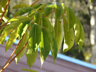
This picture represents pattern because all the leafs are in a pattern.
I think color would better in this picture & if the brown leaf wasn't there.

 Framing
This represents framing because the leafs frame the pink flower.
I think color would make it better because the color is washed away.

 Shutter Speed
This represents shutter speed because the leaf is caught in mid air.
I think a different background would be better.

 Panning
This represents panning because the background has a blur and she doesn't.
I think the color would be better and if she was a bit more in focus.

 Depth Of Field
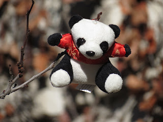
This represents depth o field because the background is really blurry and the panda is in focus.
I don't think there's anything that could make it better i like it.

Wild Card
This represents depth of field And this is my favorite picture i really like the colors and how the panda is really in focus its pretty.
There's nothing that i would want to change to make it stronger.

1. The biggest challenge for me has been trying to get good pictures & i have overcome it . There's nothing that Mr. Peterson can do to help.
2. My biggest success is not falling behind in things like blog post or other work this standout to me because if not i would have a bad grade & yes this will help me in second semester by keeping me in track of all my work.
3. I'm interested in learning many other ways a picture could be better so i could have better pictures.
4. Mr. Peterson can show us more ways to take a better picture.
5. I could keep trying to take better pictures when i don't like one to improve my pictures.

I don't have an abc's picture because we didn't have a blog post on the abc's and i don't have any of the pictures.

Tuesday, January 22, 2013

DOF Photo Corrected


 What I did to the photo was i adjusted the color and i sharpened it more.
The adjustment gave it more color and made it brighter.
I feel like it made my picture better.
There's nothing that i would want to fix i like how it looks.


 What i did to this picture was i made it more sharp and added a little more color.
The adjustment made the picture more clear and nice looking.
I feel like it looks better not as faded.
I don't think there's anything i want to change.


 What i did to this photo was make it more sharp and adjust the color.
The adjustment made the panda more dark and clear.
I think it made it look better so i like it.
I don't know if there's anything i would want to fix.


 What i did to this picture was made the flower brighter and sharpen it more.
The adjustment made the flower more bright and sharpen.
I feel like it made it better and pretty looking.
There's nothing that i want to fix.


 What i did to this picture was make it more bright and made her hair darker and more clear.
The adjustment made the picture more clear and better in the light.
I feel like it fixed my picture and it looks better.
I don't know of anything i want to fix.

What i did to this picture was it brighter and more sharp.
The adjustment made the berries more red and clear.
I fell like it looks more bright with color not as faded in color.
I don't have anything i  want to fix i like it.

1. Shallow depth of field has more of a blur in the background with a large aperture and large depth of field has the background clear and has a smaller aperture.
2. T.v mode is for the shutter speed and Av is mode is for the aperture.
3. The hardest part of this project was trying to focus the camera so the background could be blurry.